Website Development Portfolio
Rainbow Release (Frank Kewin Psychotherapy)

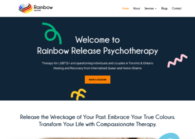
Frank Kewin partnered with Digital Giants to redesign its website – Rainbow Release into a welcoming, compassionate space for LGBTQ+ and questioning individuals and couples across Ontario. The previous website didn’t fully capture the warmth, safety, and affirming spirit of the practice. Our goal was to create an online experience that reflects the therapist’s mission, healing and recovery from internalized queer and homo-shame, while improving accessibility, navigation, and connection with visitors.
Category
Healthcare & Wellness
01
Visual Identity & Colour Language
The project began with a refreshed colour system inspired by the full spectrum of the rainbow, symbolizing inclusion, diversity, and hope. Each hue was intentionally selected to evoke calm, courage, and authenticity while maintaining clinical professionalism.
The updated palette, drawn from the brand’s existing logo, balances deep grounding tones with expressive accents like coral, turquoise, and violet to create a safe yet empowering atmosphere across every page.
Typography and white space were used strategically to let content breathe, ensuring emotional readability and ease of navigation for all visitors.


02
Location Page
The new Contact & Location page was designed as a clear, compassionate entry point for clients ready to take the next step. Instead of separating information by city, we consolidated everything into one accessible page that features contact details, a simple appointment form, and embedded maps for both Toronto and Barrie offices.
This single-page structure creates a frictionless experience for users, whether they’re booking a free 15-minute consultation or looking for directions. Optimized for local search and user intent, it ensures that visitors can quickly find the closest office, reach out with ease, and begin their therapy journey feeling supported from the very first click.
Slide to see the before (left) and after (right) of the Rainbow Release website
 - Before New Website")
 - After New Website")

Mobile-First Design
Understanding that many clients reach out via mobile devices, the website was built with a mobile-first approach, ensuring seamless responsiveness and readability.
Forms and contact details were simplified for quick, stress-free inquiries, including dual location maps for Toronto and Barrie to connect users directly to the nearest office.
Results
The reimagined Rainbow Release website now embodies the spirit of transformation it offers. It welcomes every visitor with empathy and colour, guiding them toward self-acceptance and support.